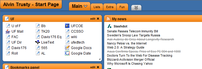
Sometime yesterday Protopage had an upgrade. Here is what the site looked like before the upgrade.

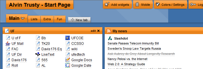
Below is the same page after the upgrade. Notice how everything is shifted down about half an inch so that the options tab can be seen at the top.

The options tab is not new. Before this upgrade, the tab was at the bottom. That was nice considering that I use the options tab only a few times each year. I have posted a “downgrade” request on the Protopage blog. While I wait for a response, I’ll spend a little more time scrolling on my startpage.

Pingback: User links about "protopage" on iLinkShare